")
A majority of us have spent more time at home in 2020 than ever. So what better time to reinvigorate our interiors and give our homes a fresh new look, as we shake off the challenges of 2020 and head into the new year?
Andrea Lucena-Orr, Dulux Colour and Communications Manager, says ‘colour and mood are intimately connected, so it’s important to surround yourself with colours that help you feel positive’.
Dulux’s colour team came up with the Dulux Colour Forecast 2021 after extensive virtual research into global design trends, settling on palettes that create a sense of reassurance and comfort.
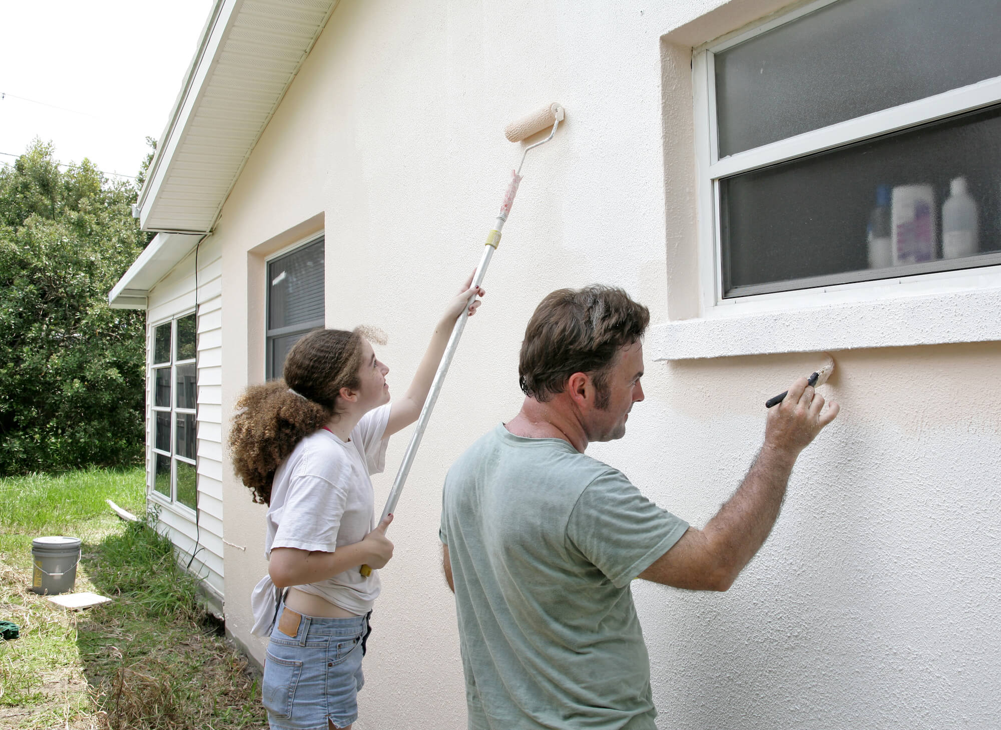
If bringing in good energy and painting your home are some of your New Year’s resolutions you should consider drawing from the Dulux 2021 Summer Forecast colour palette fittingly named Reset.
Shades in the Reset palette are restful, uplifting and inspired by nature featuring brighter oceanic shades of blue-green and coral, muted botanical greens and warm whites.
If a serene and vibrant home makeover sounds good to you, here are some different ways to introduce stylish colours that’ll help ‘reset’ your interiors and ring in the new year.
Three ways to add interest and bring positive vibes into your spaces using Dulux’s on-trend Reset colour palette:
1- A little bit dramatic.
If you don’t shy away from making a bold and fun statement in terms of your decor choices, this stunning blue-green paint (Dulux’s Daintree) could be just what your dining or living room needs.
‘This dramatic hue gives the room a distinct mood and enriches the space. The features of the room, such as the rustic brick wall, archway and timber lining, are all amplified through the use of colour and a backdrop is created to contrast against the crisp white pendant light’, Stylist Bree Leech says.
Leech recommends pairing this moody shade with zesty pops of melon and chilli in your choices of accessories and artwork.
Styling tip:
If you have an open floor plan or your room adjoins another don’t forget to consider sightlines, i.e. the other areas you can see directly into like the hallway, kitchen or a study nook.
When decorating don’t focus on each room separately, create cohesion between spaces by introducing say your new wall colour in little touches like the round cushion pictured below, a plant pot, throw rug or vase to create a design flow.


2- Ahh, hello tranquillity.
If calm is your number one priority and you don’t want to commit to too deep a shade for your makeover, but still want to play with colour, try Dulux’s refined pale green Light Ceramic.
‘The living room needed an injection of colour but to create a relaxing and casual feel, I used a gentler hue as the feature. The shelving unit is the hero of the space, so I highlighted it by painting the wall behind’, Leech says.
Compliment this refreshing shade of green with artwork and knick-knacks in peach and terracotta tones to make the wall colour sing, Leech suggests.

Styling tip:
In an open plan living room like this one, compare the colours and accessories you are intending to introduce to ensure they complement each other or are harmonious before going ahead with painting an entire feature wall or room.
Paint a small sample of the new hues on your wall to ensure you’re happy with the colours at different times of the day, under varying levels of light and once they dry.

3- Like a big warm hug.
The kitchen is the social hub of the modern Australian home, so why not ramp up its warmth and make it feel especially inviting for family and friends to come and gather over summer? Dulux’s rich and earthy shade Gold Pheasant is just the ticket for this.
‘Painting the feature brick wall in Dulux Wash&Wear Gold Pheasant added that extra warmth I was after without taking away from the best feature – the oven. The accents on this wall didn’t need to contrast, so I painted the shelving to match the wall and added an eclectic display of artwork and vessels in tonal shades,’ Leech says.
Leech adds, ’to soften the contrast between the feature wall and the white in the room. I opted to paint the rangehood a gentle blush – Dulux Wash&Wear in Treeless. This colour also sits beautifully against the brass tap’.
Encourage your guests and family members to stick around by bringing in two or three comfy bar stools. We’re big fans of these luxurious upholstery stools by Biasol in rich hues of aubergine and blush.

Styling tip:
Bring in colours to create different moods throughout your home. For example, use warmer colours for areas you socialise and unwind in like kitchens, bedrooms and living spaces. Conversely, apply bold and energising shades to utility spaces like laundries, home offices and bathrooms.
‘Changing the colour of your walls might seem like a fairly insignificant thing. However, it’s all part of self-care and surrounding yourself in uplifting hues to help you feel secure and comfortable during difficult times,’ Andrea says.
Have you sussed out the colours you want to bring into your home and the mood you want to produce in your space using quality paint?
When it comes to your DIY painting project, Andrea says, ’you can use colour to make your home whatever you need it to be, whether that’s refuge, relaxation or nostalgic memories of past adventures. There are no rules – just follow your instincts!’